I’ve been fascinated lately with candy. Why is it so pretty and why does that make you want to eat it more? Why is it so fun? Is it a nice remnant from our childhood? Or are there designers behind the scenes, carefully crafting eye-pleasing colors and shapes that make it irresistible?
All I know is, whoever came up with the term “eye candy” to name all things lovely, nailed it!
I don’t eat very much candy (dietary reasons), but every once in a while I like to go to the bins and get a little bag full of various pretty items.
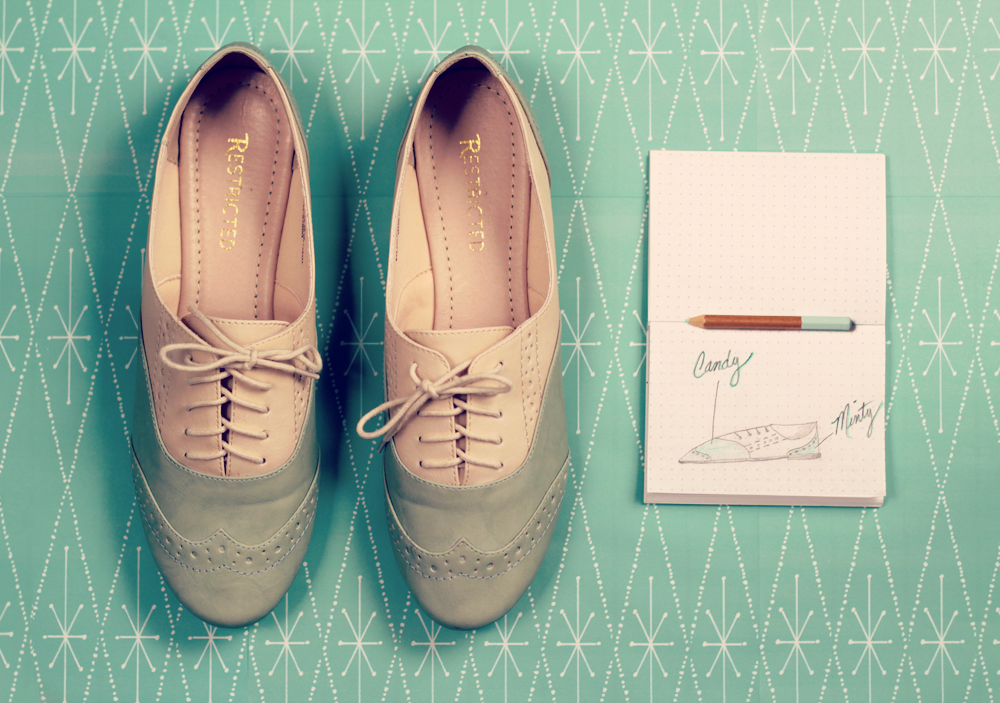
Until the next time I make a trip to the candy shoppe, I will satisfy my candy cravings with these adorable shoes I bought last week. When I saw them, I immediately thought “Oh, candy for the eyes!” and low-and-behold, ModCloth was thinking the same thing because they call them “Candy Shop Quartet Shoe“.
My favorite thing about them is the mint and vanilla combination. I’ve been on a mint kick lately, loving anything and everything mint in sight. One of the things both Koldo and I like to do is keep small records of the little things we like in our Epokka Idea Books. Something about sketching ideas out keeps them fresh in the mind for later. Candy! Mint! Fresh!
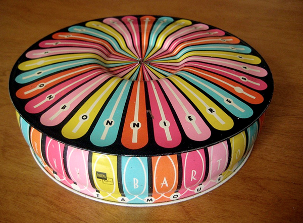
I’ve also been deeply in love with this storefront for Barton’s Bonbonniere. I wouldn’t say no to having a storefront like this, even if it wasn’t for a candy store. Actually, that’s a lie.
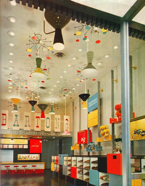
I’d be thrilled to have a store like this!
Alvin Lustig was the graphic design consultant and you can certainly see his influence on the work. Lustig happens to be one of our design heroes, so it was a pleasant surprise to find out that he contributed to this. It’s too bad that he passed away at such a young age and that this store no longer exists.
Why do the good things have to go? If you’re lucky, you might find one of the light fixtures someday on Ebay for a few grand though.
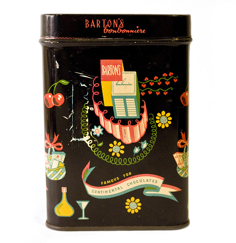
Here’s some more eye candy from Barton’s Bonbonniere for you to nibble on.
Ok, I’m curious! What was your favorite type of candy when you were a kid? And what’s it now?
————–
Photo Credits:
Shoes and Notebook: Naomi Niles
Storefront Share: Sandiv 999
First Tin: Karen Horton
Second Tin: julielion